Suchit Kakar
Aug 14, 2018

Opinion: Can Ikea crack Indian retail?

The author speaks about his experience at Ikea on day two of the store's existence in India

Opinion: Can Ikea crack Indian retail?
A DJ, an MC, crowds, bouncers and barricades. Words you’d use to describe a concert also perfectly describes everything you see while standing in line to enter Ikea, Hyderabad on its second day.
 
Ikea’s first foray into India is truly big news. Having already made its presence in a significant part of the world, it was only time until they found their way here.
 
Ikea is not just known for its wide range of products, but also for its unique retail experience. How does that experience translate in the Indian context? As a retail specialist, I was curious to find out.
 
Let’s start at the beginning, right at back of the queue.
 
Build hype
 
Blaring techno music, an MC to engage the crowds, bouncers to manage them and a never ending, serpentine maze-like barricade to get through before you even enter the store. A perfect way to manufacture hype –making it feel like a special experienceand makes you feel special for having made it through.
 
Takeaway: If it looks, sounds and feels like a big deal, it probably is a big deal.
 
Set expectations right away
 
Ikea prides itself on its competitive prices. Their fascia has an image of their Rs 149 Chicken Meatballs, and the very first item you see is a Rs 15 set of spoons.
 
Every section has a “Our Lowest Price!” wall and every price tag a placebo MRP, to emphasize how low their prices go.
 
While some retailers might avoid this approach, it works well for Ikea, signalling that it understands the Indian market’s expectations of prices.
 
More importantly, I feel, it encourages people to buy more, not for a want or need, but for a good deal.
 
Takeaway: Set the context in which you want to be seen, before customers do that themselves.
 
Appeal to dreams
 
The in-store journey begins with Ikea’s ‘Homes’ - fully furnished spaces that can be mistaken for real homes, if not for the price tags.
 
While nearly everything you lay your eyes on can be bought, the importance of this space is not selling individual products, but, I believe, to sell the look and feel of your dream home.It’s the sale of the intangible - of a feel of what could be.
 
To get as close to your needs, these dream spaces come in a variety of sizes and budgets, ensuring that nothing seems out of reach.
 
Takeaway: Sell the big picture. Sell customers their dreams.
 
Guide from a distance
 
The store is 4,00,000 sq.ft., displaying an estimated 7,500 products.Sounds overwhelming, but I feel they have it under control.
 
There is a fixed journey to follow, but it flows so naturally that one feels that they’re exploring in their own way.
 
So, while it seems overwhelming, you’re never lost. Help is everywhere for those who seek it and invisible to those who don’t.
 
Takeaway: Make customers feel they’re in control (even though you are)
 
Sell benefits not features
 
Ikea does not simply say what a product is, but describes what it can be.
 
A sofa isn’t a just a sofa, but a place to “plunge into a warm, personal and cosy atmosphere where you can pamper yourself and enjoy life’s little pleasures.”
 
A vegetable toy set is an opportunity to “encourage role play which helps children to develop social skills by imitating grownups and inventing their own roles.”
 
Their tone of voice is of someone who understands you and your needs. 
 
Takeaway: Let your customers know what’s in it for them.
 
Start with dessert
 
At the centre of the store is a 1,000-seat restaurant where dessert is served first. Targeting you when you’re at your hungriest and most vulnerable to temptation. I could not spot a single plate without some dessert.
 
Anticipating large crowds and long wait lines, they’ve limited their food menu to just 5 items, I believe, to make it quicker for you to decide. They call themselves #Swed-esi– food for Indian tastes combined with western dining concepts.
 
Takeaways: Keep your options simple to keep your lines moving
 
Make it easy to decide
 
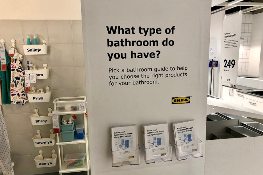
Beds, kitchens, wardrobes are all big investments. Ikea attempts to cover all potential worries and queries you may have before buying, to help ease your decision-making.
 
They try to anticipate questions, and answer them through the store design, before you can think of them. 
 
Picking individual elements too much of an effort? You can buy an entire kitchen set up as-is. Concerned about maintenance? Certain products come with tips on how to clean them. Worried that your child might outgrow a bed? They have extendable children beds.
 
Takeaway: To get someone to buy, take away reasons for them not to.
 
A relaxed shopper spends more
 
It appears that Ikea understands the importance of a relaxed shopper. 
 
There are multiple free lockers to keep your belongings and keep your hands free.
 
They’ve implemented ways to keep children entertained, knowing that if they are happy, you’ll shop in peace.  I noticed the area where you get your items packedhas a mini kitchen for your children to play in. Where you need to spend time with staff to help design your wardrobe, there is a screen to keep kids occupied.
 
There are 17 normal check-out counters, as well as express and self check-out counters. As a result, the buying process went along a lot smoother than expected, leaving me quite pleased.
 
Takeaway: The best way to hold attention is to alleviate distraction.
 
That being said...
 
Ikea seems to be doing a lot right, though that doesn’t mean there aren’t concerns.
 
The “Homes”, though beautiful, are decidedly Western. This might appeal to aspirational Indians but somethingthat may not attract traditional buyers.
 
The ‘Self-Serve’ process for large items, appears to confuse and frustrate some shoppers who required additional aid and assistance.
 
One of Ikea’s key offerings is hyper-personalisation. This amount of control sounds great, but at times one just looks for an expert to take the final call. 
 
While theyclaim to have an “open for all” policy, and their pricing makes them seem very inclusive, the fact that all their signage is primarily in English feels a bit excluding.
 
As Ikea has already changed for India in many ways maybe the question is,has it changed enough?Will their big bet pay off and is the timing right for consumer to meet them half way? We’ll be watching.
 
(The author is insights manager at Fitch)
Source:
Campaign India

Related Articles

Just Published

30 minutes ago

Reliance Disney merger: A game-changer for ad ...

SOUNDING BOARD: While the merger could potentially reshape OTT advertising with premium targeting, the reduced ad inventory raises challenges for agencies, limiting their negotiation leverage.

3 hours ago

How brands can actually save the planet (No, ...

Authentic sustainability demands action, not just slogans. ABND’s founder and partner states that it's time for brands to ditch pretence and embrace authentic, planet-positive strategies.

4 hours ago

Buckle up for safety: Cars24 drives home a ...

It tells consumers that before they invest in that flashy car mod, they should consider this: nothing’s cooler than keeping your child safe.

2 days ago

Matchmaker, matchmaker, find me a mattress

Popular matchmaker Sima Taparia features in The Sleep Company's new wedding campaign, this time matchmaking mattresses.