Gunjan Prasad
Jul 28, 2012

The London 2012 brand: Making it about ‘Everyone’

In 2007, Wolff Olins, the London-headquartered branding agency was handed the mandate of creating the emblem and associated corporate identity for the London Olympic Games and Paralympic Games 2012. It’s been five long years for the agency. Initial criticism of the logo has given way to appreciation of the branding effort with multiple applications. Days before the Games are flagged off, Gunjan Prasad spoke with Charles Wright, MD, Wolff Olins, to understand the evolution of the ‘2012’ brand.

The London 2012 brand: Making it about ‘Everyone’


What was the design brief at the time of the pitch? What went in Wolff Olins’ favour?

The story of the London 2012 brand actually began before the brief - with an ambitious bid delivered to the International Olympic Committee (IOC) by Lord Sebastian Coe in Singapore in 2005. This successful bid led to the creation of an equally ambitious brief from London Organising Committee of the Olympic Games (LOCOG): to provide an enduring sporting legacy and to make Olympics an inspiration for common people to choose sport.

During the pitch, we proposed a step change for the Olympic movement. That was moving the Olympics from being about nations, to being about people; from being about the two weeks of the Games to being about every day; from being about sport to being about more than sport; from being about watching, to being about doing; from being for people over 35, to being for people of all ages; from being about the TV to being about the street; and from being about elite athletes to being about everyone. And we came on board.

What was the creative thought behind the brand? Can you elaborate on the logo itself?

As the bid was about young people, about more than sport and about everyone, everywhere, we understood that the Olympics needed to be beyond sport, beyond London, and beyond the Games. If these Olympics were to have an existence beyond the Games then they needed a brand. That brand would be 2012 and the form 2012 would have meaning and relevance independent of the Olympics. Market research with children and adolescents told us that the brand language needed to be urban as opposed to municipal; it had to belong to the streets as opposed to an institution. This language had to be rooted in something. We wanted to return to the meaning of ‘Olympism’ – energy. So we created an energy line grid. From this the brand language and the 2012 mark emerged.

We created a form for 2012 that was flexible and allowed different uses – in order to manifest the brand idea of participation. The form could be a window to sponsor brands.  It could sometimes use the Olympic rings, sometimes use the Paralympic symbol and sometimes use the word ‘London’ inside it. Sometimes it can stand alone. This meant that after the Games, the Olympic rings could be removed and the 2012 form would remain relevant. Creating a form with such flexibility meant that it allowed us to extend the reach of the Games by extending the use of the logo to non-commercial organisations.

How easy is it to merge tough business realities and astute thinking with softer, intuitive creativity? Any examples of this marriage between the two in London 2012 Olympics branding?

Most large sporting events today depend to some large degree upon commercial sponsorship. London 2012 is no exception. As you might expect, use of the 2012 mark is carefully prescribed in sponsorship agreements, which give the top tier of sponsors special advantages.

It may be an exaggeration to label this practice a “tough business reality” because such sponsorship is now almost standard. So when we designed the 2012 logo, we did so specifically ensuring it works well with sponsors’ brands.

The streets of London are busy with UPS trucks displaying the 2012 logo, with taxis showing 2012 alongside GE and so forth. A happy marriage perhaps, because the sponsors are pleased with the flexibility the design system allows them.

What were the various roll-out phases and what was the scope of work beyond the logo? How was the brand identity extended into sponsor associations, merchandise, etc.?

As for the scope of work beyond the logo, we created a brand strategy for the London Olympics, which also included brand language and visual identity that included the logo. We provided LOCOG with a bespoke online brand management system and a full toolkit of artworks, templates and user specific guidelines (sponsors and noncommercial partners) which enabled their in-house team and agency partners to roll out the brand. We also worked with LOCOG to brief the initial national and global sponsors on the brand and helped some develop the scope of their activation plans and use.

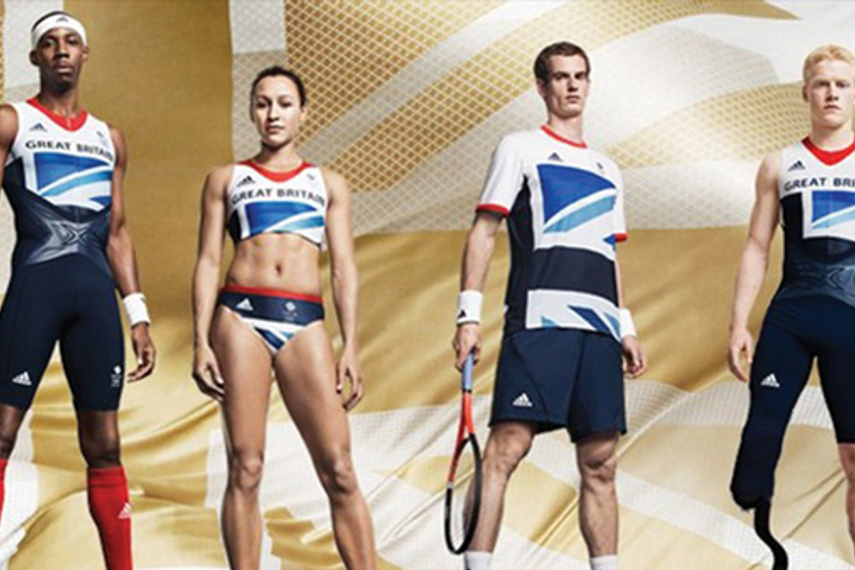
In order to extend the brand identity to sponsor associations, merchandise etc., a sponsorship strategy was part of the brand strategy we devised for LOCOG. This strategy has enabled LOCOG to beat their target sponsorship figure.  Olympic sponsors were able to activate the brand strategy. Adidas is a great example of this. In late 2007, Adidas was unveiled as a ‘Tier One’ sponsor for the London 2012 Olympics.  Attracted by what London 2012 stood for and wanting to make the most of the relationship, Adidas asked Wolff Olins to help align its brand ‘Impossible is nothing’ to the London 2012 brand. Adidas also wanted Wolff Olins to help show that it was the best placed sportswear company to supply all athletes of both London 2012’s Olympic and Paralympic Games. By bringing the two brand ideas together, ‘Impossible is nothing’ and ‘Everyone’s Olympics’, Wolff Olins created the idea of ‘Everyday sport’ taking sport off the pedestal and onto the street.

The immense media criticism that London 2012 logo has seen is possibly path-breaking in the world of design. Far from being ‘inspirational’, some critics called it a “visual irritant”. How did the agency react and defend its design on such a big and public stage? 

We were proud of the work when it launched, and we’re still proud of it now – it’s a cool, urban brand. We knew at the time that we were creating work that needed to feel fresh five, or more, years after it launched. For that reason the form itself feels dissonant – it releases something, it’s not a contained thought, it’s not resolved.

Just as the creative criticism ebbed, there has been initiation of legal proceedings against Wolff Olins on grounds of copyright infringement of an original work (Infinitude II). How has the brand consultancy reacted to these charges? Was changing the logo ever a possibility?

We cannot comment on specific legal proceedings.

From initial criticism to mixed reactions subsequently and positive testimonials coming in today – is it a case of the branding element growing on the audience? What is Wolff Olins’ view on this?

It is possible that familiarity may have reduced some of the noisy criticism that first greeted the brand’s launch.  But what is perhaps also now being appreciated is more of the rationale behind the design. Without such understanding, the only possible reaction is aesthetic: ‘I like this’ or ‘I don’t like that’.

Perhaps now, commentators may also be able to judge whether the design in particular, and the brand in general, have fulfilled their intent.  I believe they have.

Source:
Campaign India

Related Articles

Just Published

13 hours ago

Rural consumption continues to outpace urban ...

The latest data from NielsenIQ indicates that rural areas have become the primary driver of consumption growth in the FMCG sector, a reversal of previous trends where urban centres led growth.

14 hours ago

Havas to offer staff up over $40 million in ...

Bosses could get extra $8 million in cash bonuses for working on separation from Vivendi, prospectus reveals.

15 hours ago

FCB/SIX India announces key senior leadership ...

Since its launch in 2023, the agency’s staff has tripled, now numbering approximately 170 team members.

16 hours ago

Trump’s victory isn’t just America’s crisis—it’s a ...

Make no mistake—2024’s US election was a calculated exercise in marketing from beginning to end, revealing a striking alignment with the very principles that drive our industry.