Please sign in or register
Existing users sign in here
Having trouble signing in?
Contact Customer Support at
[email protected]
or call+91 022 69047500
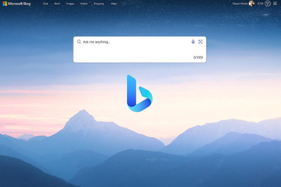
Hot on the heels of rebrands at YouTube and Yahoo, Microsoft's Bing has been become the latest digital brand to undergo a visual identity overhaul.
Contact Customer Support at
[email protected]
or call+91 022 69047500
Top news, insights and analysis every weekday
Sign up for Campaign Bulletins
.jpg&h=268&w=401&q=100&v=20250320&c=1)
HUL to take down digital versions of the campaign; Honasa removes social media posts making a reference to Lakmé.
.jpg&h=268&w=401&q=100&v=20250320&c=1)
Aims to help brands deliver 3x consumer engagement for their IPL ad campaigns.

Creator journalists and UGC are starting to draw more attention from advertisers wary of potentially distressing content on news brands.
Wren was speaking at the Q1 earnings call and expects to close the IPG acquisition in H2 2025.
.jpg&h=334&w=500&q=100&v=20250320&c=1)
.jpg&h=334&w=500&q=100&v=20250320&c=1)


.jpg&h=334&w=500&q=100&v=20250320&c=1)


.jpg&h=334&w=500&q=100&v=20250320&c=1)
.jpg&h=334&w=500&q=100&v=20250320&c=1)


.jpg&h=268&w=401&q=100&v=20250320&c=1)