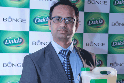
Bunge India has unveiled a new identity for its edible oil brand, Dalda, to contemporise the brand and gain acceptance across younger, edible oil consumers who look for health and yet do not want to compromise on taste of their food.
Said Adhiraj Sarin, managing director, Bunge India, “Bunge understands that Indian consumers have changed significantly in the last few years, and it was imperative that with the edible oil business being one of our future growth drivers, Dalda needed to re-invent itself. Our extensive consumer research has shown that Indian consumers though health conscious believe that they are compromising on taste when it comes to edible oils. Dalda Husband’s Choice oils will address this concern with an upgraded product offering through added vitamins along with the heritage of taste that it owns.”
Explaining the thought behind the logo, Sarin added, “Gold Ribbons in the logo signify premium values, and a seal of protection; mother and child symbol connotes the purity and caring nature of the brand; Bunge’s endorsement is a guarantee of International quality and credibility and white font connotes modern, contemporary brand, clear, safe & pure.
The logo has been designed by Shombit Sen Gupta of Shining Consulting. The campaign to promote the new look of Dalda is expected to break soon.


.jpg&h=334&w=500&q=100&v=20250320&c=1)


.jpg&h=334&w=500&q=100&v=20250320&c=1)


.jpg&h=334&w=500&q=100&v=20250320&c=1)


.jpg&h=268&w=401&q=100&v=20250320&c=1)
