Campaign India Team
Jul 23, 2009

Apollo Tyres' new website aims for more transparency

Apollo Tyres, which recently underwent a repositioning effort, has unveiled its new website in an exercise that the company calls an attempt to reflect the structural changes that the brand has gone through in the past three years. The site has been created by theIdeaWorks. It consists of five landing pages. The first is for India, second for its Corporate site, a third for Europe and a fourth for South Africa. The fifth is for other markets.  

Apollo Tyres' new website aims for more transparency
Apollo Tyres, which recently underwent a repositioning effort, has unveiled its new website in an exercise that the company calls an attempt to reflect the structural changes that the brand has gone through in the past three years. The site has been created by theIdeaWorks. It consists of five landing pages. The first is for India, second for its Corporate site, a third for Europe and a fourth for South Africa. The fifth is for other markets.  

Talking to Campaign India, Kankana Das, head, corporate communications, Apollo Tyres explained that the new website was a key part of the brand’s recent restructuring. “Apollo Tyres has undergone a complete corporate identity change in recent times. The website too needed to reflect this change in identity, which we have now incorporated. We thought this was an opportune time to upgrade the services and information that we offer through the Apollo Tyres website; to reflect the structural changes that Apollo Tyres has gone through in the past three years of expanding beyond India, into other countries and continents like Africa and Europe,” she said. 

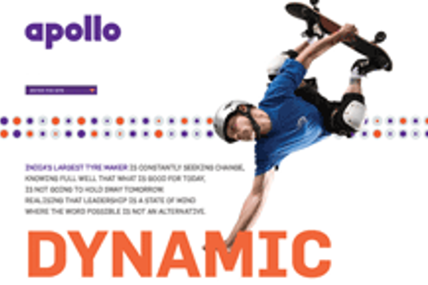
Das says the key objective behind launching the website was to mirror Apollo Tyres as a young, dynamic, global and vibrant entity.

“Our new identity, as designed by Wally Olins of Saffron and his team is colourful and vibrant. It is very unlike the identities of other tyre companies. theIdeaWorks has done a marvellous job in bringing this out on the web forum. In addition to depicting the youthfulness and customer connect they have made the website easy to use (three clicks to get to any information you want), built in a "fun zone", added Das.

“We are working on games for greater involvement, a contest is currently on and we are also looking at bringing into the site a blogging area for customers that will carry transparent customer feedback on products and usage,” she said, adding, “The site, as theIdeaWorks has designed it, allows us and them to continue to build on it with more interactive and customer focussed items.”

The site has a Products section which allows users to access all the details that they need, to make their choice. It also provides access to the company’s key passenger car dealers in India. “You will understand that for the external world, this is the first point of contact with a company and therefore Apollo's web presence needs to give viewers the right first impression, which the new site does -- clean, easy to navigate and transparent in sharing information. Today's need is to allow customers, investors and media easy access to authentic information and the website achieves that,” added Das.

“The basic idea was to extend Apollo's new visual identity to the online medium and establish Apollo Tyres’ presence on the web, with the use of the typeface, colours and graphic circular forms as recommended by Saffron,” said Sudhir John Horo, principal designer and co-founder, theIdeaWorks, “Our effort here was to give an Indian multinational a more global look and feel. We have provided plenty of breathing space through structured placement of elements and created a clutter-free viewing environment. Images have been used to make the site visually attractive while keeping in mind the quick download of site pages.”


Source:
Campaign India

Related Articles

Just Published

2 days ago

89% of CMOs predict growth in their marketing ...

Nearly 59% of CMOs expect that in the next five years, their revenues will come from products, services, or businesses that don’t yet exist, finds Dentsu's 2024 CMO Navigator survey.

2 days ago

'All polish, no punch': Adland reacts to Jaguar’s ...

The internet has spoken about Jaguar's radical rebrand with mixed reviews. But what do industry experts think?

2 days ago

Parle’s ‘GIF it a go!’: A sweet play on connection ...

The Minimalist's GIF-inspired campaign for Hide & Seek captures Gen Z with humour, relatability, and everyday moments.

2 days ago

VdoCipher introduces live streaming services to ...

Real-time engagement through live streaming offers Indian advertisers a robust tool for deeper connections and data-driven campaign optimisation.