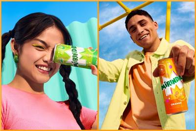
Mirinda is the latest consumer brand in the past month to unveil a new look to court Gen Z consumers.
The global PepsiCo-owned soda brand tapped its in-house design team to double-down on using bold colours to represent its many fruity flavours, along with an playful explosive font and an ample serving of the letter 'M' in its brand assets to underscore good taste, in a yummy sense (Mmmmmm, get it?). The new visual identity, in fact, has been called 'Making an M-pact'.
Here's how the brand describes the changes:
The Mirinda logo has been refreshed with a brighter green, along with sharper corners and cleaner lines to amplify its distinction. The iconic Mirinda ‘M’ serves as a canvas of creativity from which the brand is brought to life. The new visual identity features playful colour palettes which provide a burst of refreshment, while twirling spheres, fizzing bubbles and zesty fruit illustrations convey a sense of playfulness and energy throughout.
As Mauro Porcini, SVP and chief design officer of PepsiCo further explains, “Mirinda’s 50+ flavours are a treat for the senses, and we wanted the brand’s visual identity to look and feel the same...with vibrant, contrasting colours and bespoke illustrations that create a sense of dynamic energy and playfulness. We know Mirinda fans engage with the brand digitally as much as they do physically, so we created a visual identity that retains its excitement and distinction across all platforms.”

The new identity initially launches in Vietnam and Thailand and but will quickly be rolled out across 20 international markets this month in Poland, Romania, Czechia, Ukraine, Hungary, Croatia, Gaza/Palestine, Mexico, Argentina, Egypt, Iraq, Uganda, Ethiopia, China, Pakistan, Kuwait, Qatar, Oman, Bahrain, and the United Arab Emirates and more. The new visual identity will be visible on all Mirinda cans, merchandise, advertisements, retail displays and digital media across its 200 markets.
The press materials introducing the launch describe how the redesign is meant to provide inspiration for Gen Z creators, embracing their creativity and courage to express themselves. PepsiCo's VP of global brand marketing, Eric Melis, goes as far as to say it "empowers this generation to resist conformity and instead, embrace self-expression."

(This article first appeared on Campaign Asia)


.jpg&h=334&w=500&q=100&v=20250320&c=1)
.jpg&h=334&w=500&q=100&v=20250320&c=1)


.jpg&h=334&w=500&q=100&v=20250320&c=1)

.jpg&h=334&w=500&q=100&v=20250320&c=1)


.jpg&h=334&w=500&q=100&v=20250320&c=1)

.png&h=268&w=401&q=100&v=20250320&c=1)


