Arati Rao
Sep 02, 2010

“The clearer and simpler the message, the more effective it will be”: Bruce Duckworth

In a Q&A with Campaign India, Bruce Duckworth talks about the importance of simplicity in design, a theme he will touch upon, as a speaker at the upcoming Kyoorius DesignYatra 2010.

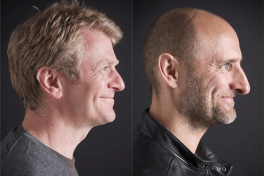
Bruce Duckworth (L) & David Turner (R) will speak at Kyoorius DesignYatra 2010

Bruce Duckworth and David Turner are designers, close friends and founders of Turner Duckworth, the brand design agency based in London and San Francisco. Turner Duckworth’s mission is to create iconic design for culturally significant consumer brands.The design agency has won over 200 international design awards, including everything from the D&AD pencil and 16 Clios, to the first ever Cannes Lions Grand Prix, and even a Grammy. Their work and opinions have been published in many design books and magazines all over the world, and they’ve sat on award juries as well.

The duo feature among the speakers at Kyoorius DesignYatra this year, to be held on September 3 & 4 at Renaissance Marriott Powai. In an interview with Campaign India, Duckworth talks about the benefits of cross-cultural collaboration, among other things.

What is your perspective on Indian design and the kind of work that you see coming out of the country, both commercial and non-commercial?
 
India is mostly reported in terms of a growing economy that is on the way up. Most design we see is the traditional cultural design which has a distinctive look. When I’ve judged international awards, Indian agencies are entering more and more design. I’ll be fascinated to see what’s new at the conference.

The theme at DesignYatra this year is “Order & Chaos”...considering the work you’ve done on Coca Cola, which was essentially making the communication simple, how does that tie in with the body of work that you have? 

Our redesign of Coca Cola for North America resulted in a simpler graphic identity to help express the authenticity of the brand by getting rid of superfluous design clutter leaving the authentic design elements behind. The world that brands now have to communicate in, is more chaotic than ever before and our belief is that the clearer and simpler the message, the more effective it will be.

What are you scheduled to talk about at DesignYatra?

Iconic brands. Why design is such a key communicator in today’s world, what are iconic brands and why it’s important to create iconic brands. We will show some examples of our work and share our experiences and anecdotes.
 
On the website, you’ve mentioned cross cultural collaborations between your London and San Francisco offices...could you give an instance of a project that went through this kind of dialogue and benefitted from it? [Also, Duckworth is based in London and is jointly responsible for Turner Duckworth’s creative output with Turner, who is based in San Francisco.]

Since day one, 18 years ago, we have worked on projects in both studios at the same time. It provides a different perspective, a greater breadth of design thinking, twice the scrutiny of the quality of design solutions and it’s most importantly it’s varied and fun. The Metallica project is a great example of both studios working on one brief and there being a friendly rivalry between the designers to get their solution through. In the end, the idea came from San Francisco, the logo from London, and the photo shoot was in London, and the artwork roll out from San Francisco. One of our London designers was a lifelong fan of the band and so we sent him to San Francisco to the presentation… That made his day!

When you mention the Turner Duckworth process (with a small “p”) on the website, what really goes through your minds when a new brief comes in? 

We just try our hardest to answer the brief in the most creative way. I don’t think there’s a secret ingredient. We are a design-led company and use visual strategy to achieve a clarity of thought. We judge our designs on ease of communication, emotional elements that draw consumers in and a touch of wit to engage them with. Ultimately, we are looking for that great idea which is unique and makes the hairs on the back of your neck stand up…perhaps that’s the secret ingredient!

Source:
Campaign India

Related Articles

Just Published

2 days ago

89% of CMOs predict growth in their marketing ...

Nearly 59% of CMOs expect that in the next five years, their revenues will come from products, services, or businesses that don’t yet exist, finds Dentsu's 2024 CMO Navigator survey.

2 days ago

'All polish, no punch': Adland reacts to Jaguar’s ...

The internet has spoken about Jaguar's radical rebrand with mixed reviews. But what do industry experts think?

2 days ago

Parle’s ‘GIF it a go!’: A sweet play on connection ...

The Minimalist's GIF-inspired campaign for Hide & Seek captures Gen Z with humour, relatability, and everyday moments.

2 days ago

VdoCipher introduces live streaming services to ...

Real-time engagement through live streaming offers Indian advertisers a robust tool for deeper connections and data-driven campaign optimisation.