Campaign India Team
Aug 30, 2023

Eveready gets new logo as part of rebrand

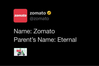
Rolls out a campaign to highlight its rebranded identity as well

Eveready gets new logo as part of rebrand
Eveready Industries India has announced its rebranded identity. 
 
 
With this revived identity, the brand has rolled out a campaign conceptualised by Ogilvy and unveiled a new logo. 

 
Anirban Banerjee, senior vice president and SBU head (batteries and flashlights), Eveready Industries, India, said, “ The iconic Eveready brand has enhanced its respect, reach and recall over time, matching its products and quality with the best in the world. With evolving consumer needs, the brand needed to transform and expand its portfolio, offering powerful, premium and innovative products. It was thus important for the brand to be seen as relevant and contemporary across age groups in the new world as it straddled the new portfolios.”
 
Banerjee added, “What happens when you pass energy through the Eveready disc? It starts to move and gather momentum. As the pace of the spin increases, the moving shape assumes the form of an infinity symbol. The new logo in motion stands for the brand’s vision of limitless progress and infinite power.” 
 
Sukesh Nayak, CCO, Ogilvy India, said, “Eveready stands for limitless power and dynamic possibilities. It is ever-evolving, constantly changing and forever transforming to keep India moving towards exponential progress. This zest for dynamism, infinite energy and endless possibilities finds form in the newly revamped Eveready logo. The new logo is a symbol of power without a pause. Revamped and animated, it evokes the idea of momentum, forever on the go. It forms the loop of infinity, to denote eternal drive, the spark of new beginnings. That’s why the latest rendition of the logo comes with an additional line: Give me power. Eveready is the future of power. Infinity is the soul of new Eveready.”
 
Source:
Campaign India

Related Articles

Just Published

6 hours ago

Cheil X's new visual identity dips into its Korean ...

The symbol also signifies the agency's readiness for its next growth phase, highlighted by the opening of a new office in Mumbai.

8 hours ago

Nature puts Uppercase’s tough, eco-friendly travel ...

It wittily tests the brand’s rugged, eco-friendly luggage against nature's toughest terrains, challenging its innovative design to emerge unscathed.

8 hours ago

Creativity is the penultimate business truth for ...

Winning five Lions at Cannes showcases the agency's tilt to forward-thinking creative solutions and its commitment to produce impactful work that truly makes a difference.

9 hours ago

Was WPP right to give Elon Musk a platform at ...

Elon Musk’s presence at Cannes Lions sparked debate along the Croisette and across adland.