Brand solutions agency, Rediffusion has unveiled its new brand identity.
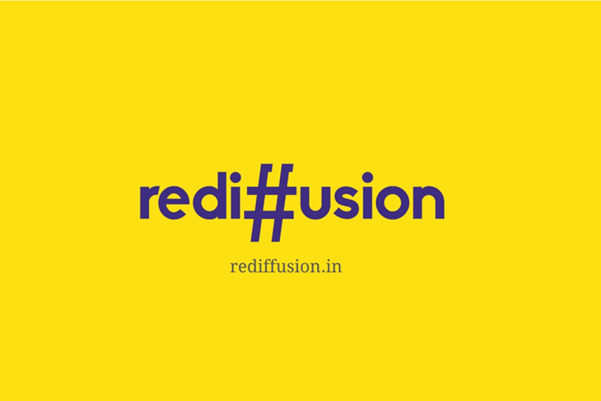
The new logo procured exclusively by Campaign India, has the hashtag replacing the twin 'f' letters in the name while the font colours move away from the previous lighter shade of blue to a deep purple hue.
The agency has a new name - Rediffusion Brand Solutions as its single-minded goal is to be a one-stop solution for brands and the problems they face in the marketplace.
Navonil Chatterjee, joint president and chief strategy officer, Rediffusion Brand Solutions, said, “Our belief is that Creativity needs to be amplified to the power of technology to arrive at break-through solutions for brands. And when creativity meets technology, the result is connections, conversations and conversions. That’s the future of brand building and that’s what this new Rediffusion is poised to deliver on.The new identity is a play on bright yellow and purple and is undoubtedly, new-age. Yellow stands for freshness, positivity, clarity, energy, optimism, enlightenment, intellect and joy while Purple represents creativity, magic, wisdom, independence, power and ambition!"
In a joint statement then, Nanda and Balakrishnan had said, “45 years back, we started Rediffusion with the vision of creating a passionate and bold agency that would take ownership of its clients and their work; with the promise of creating dynamic, fearless and category-busting work. As communication is undergoing a revolution in this hyper-connected and technology-oriented world, it’s time Rediffusion rode this new wave with a new freedom, zeal and passion. We believe we will be able to deploy a variety of digital tools and creative styles more swiftly, if Rediffusion is on its own.“


.jpg&h=334&w=500&q=100&v=20250320&c=1)
.jpg&h=334&w=500&q=100&v=20250320&c=1)


.jpg&h=334&w=500&q=100&v=20250320&c=1)


.jpg&h=334&w=500&q=100&v=20250320&c=1)
