National Insurance Company (NIC) has announced a change in its corporate identity. The new logo aims to signify an easy communication process through structural, system and operational changes. The company has entered into a deal with HCL Technologies, which will be responsible for setting up and managing a new enterprise solution.
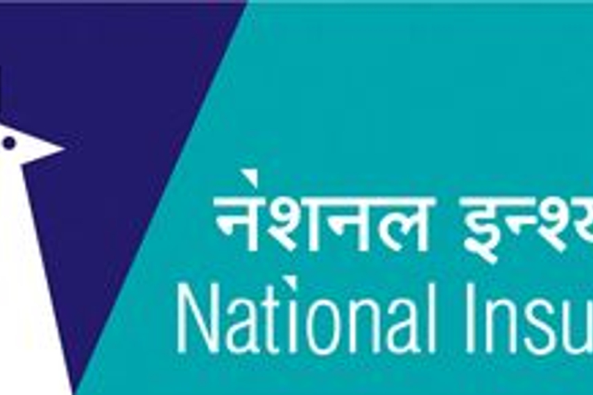
The new identity, a simplified version of the existing peacock form, is along the lines of the company’s philosophy – ‘Thoda simple socho’. The new peacock form suggests boldness and pride. A second shade of blue is introduced to make the identity cheerful and young. The new identity has been created by Grey Worldwide.
V Ramasaamy, chairman and managing director said, “At National Insurance, we have embraced change and simplified our processes to meet customers’ requirements at all times. Simplicity is now part of our progressive stance. And that starts with our new look. It is a small part of the many changes that we have put into action, to provide the customers with prompt and hassle free services…the simple way”.
He added, "As our quality, performance and service leadership have satisfied an increasing number of customers across the country, the new logo is a promise towards delivering better customer service. With the set up of specialized hubs for claim settlements, document generation, accounting process etc, the new system and technology will help us in providing quick and easy services to our customers. The evolution of our identity indicates the growing significance of our brand and marks a milestone in our progress”.
.jpg&h=334&w=500&q=100&v=20250320&c=1)
.jpg&h=334&w=500&q=100&v=20250320&c=1)


.jpg&h=334&w=500&q=100&v=20250320&c=1)
.jpg&h=334&w=500&q=100&v=20250320&c=1)


.jpg&h=334&w=500&q=100&v=20250320&c=1)