
Bumble, a dating app that distinguishes itself by requiring women to initiate conversations with male matches, has unveiled a vibrant new identity with a bold global campaign, marking the first chapter of its evolution.
Recognised by its distinctive hexagonal, beehive-themed logo in bright 'honey' yellow—a nod to the queen bee power dynamic—the app now sports a fresh logo, bolder fonts, and updated colours and illustrations.
Coinciding with this aesthetic overhaul is a product revamp, including an updated compatibility algorithm named 'Opening Moves.' This new feature enhances user choice by allowing women to use either one of Bumble’s suggested icebreakers or create their own to start conversations, such as “The world would be a better place with” and “Who is your dream dinner guest?” This modification aims to lessen the pressure on women by enabling them to set prompts to which male counterparts can respond, initiating dialogue.
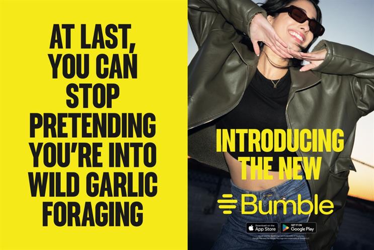
According to Bumble’s research, which surveyed 6,138 women globally aged between 23 to 35 years from April 5 to 12, nearly half reported that having varied ways to initiate a conversation would improve their experience on the app.
The refresh is a strategic move to reinvigorate interest in a market segment that has seen waning engagement post-pandemic, as younger people explore other social platforms or opt for in-person interactions. In anticipation of the launch, Bumble teased the new changes with a Renaissance-style campaign that highlighted the online dating fatigue experienced by many women. The full campaign, both digital and physical, has rolled out across over 10 countries with the tagline, “We’ve changed so you don’t have to.”

In India, Bumble increased anticipation with a teaser video on its Instagram account showcasing a 'sleepy girl' image as the profile picture. The campaign also includes 'flip It', a video that teases upcoming enhancements aimed at improving women's online dating experiences. A subsequent out-of-home (OOH) campaign will be launched later in the month, featuring prominent placements over Bandra's largest traffic signal and across popular malls like DLF Cyber City and DLF Promenade in New Delhi.
Bumble's data reveals that three in four women surveyed find the aesthetics of a dating app crucial to their overall experience, with 65% stating that a visually appealing identity makes an app easier to use.
In an industry where first impressions are pivotal, Bumble's logo—symbolic of warmth and positivity—targets the desired audience to boost user engagement. In contrast, Tinder leverages its flame symbol, which has reached iconic status, akin to the Nike Swoosh, boasting 75 million active monthly users across 197 countries. Similarly, on its 10th anniversary, the sex-positive dating app Feeld introduced a new logo combining soft and sharp edges to represent a broad spectrum of intimate practices, steering clear of the conventional rainbow motif.


.jpg&h=334&w=500&q=100&v=20250320&c=1)
.jpg&h=334&w=500&q=100&v=20250320&c=1)

.jpg&h=334&w=500&q=100&v=20250320&c=1)


.jpg&h=334&w=500&q=100&v=20250320&c=1)
.jpg&h=334&w=500&q=100&v=20250320&c=1)


.jpg&h=268&w=401&q=100&v=20250320&c=1)
.jpg&h=268&w=401&q=100&v=20250320&c=1)
.jpg&h=268&w=401&q=100&v=20250320&c=1)
.jpg&h=268&w=401&q=100&v=20250320&c=1)
